

M1 Onboarding
Adventures in onboarding optimization, runing experriments and following the data. Hoping to bring more people onto our platform and increase the amount of customers using more than 1 product.
.jpg)
10%
Increase in overall conversion rates
50%+
Conversions on our premium product
2 Less Screens
Screens we were able to remove from KYC

Our original flow required all new users to open an invest account first. That was a product decision made early in the company's history, but it no longer reflected how users were actually engaging with the platform. Users who wanted to add a second product later faced friction: re-entering information, navigating flows that weren't designed for their context, losing momentum.
The fix was straightforward in concept: give users a choice upfront. The compliance requirements around that choice made it significantly more complex. Each account type carried its own KYC path, which meant a decision on screen one cascaded through 18 legally-required screens downstream.
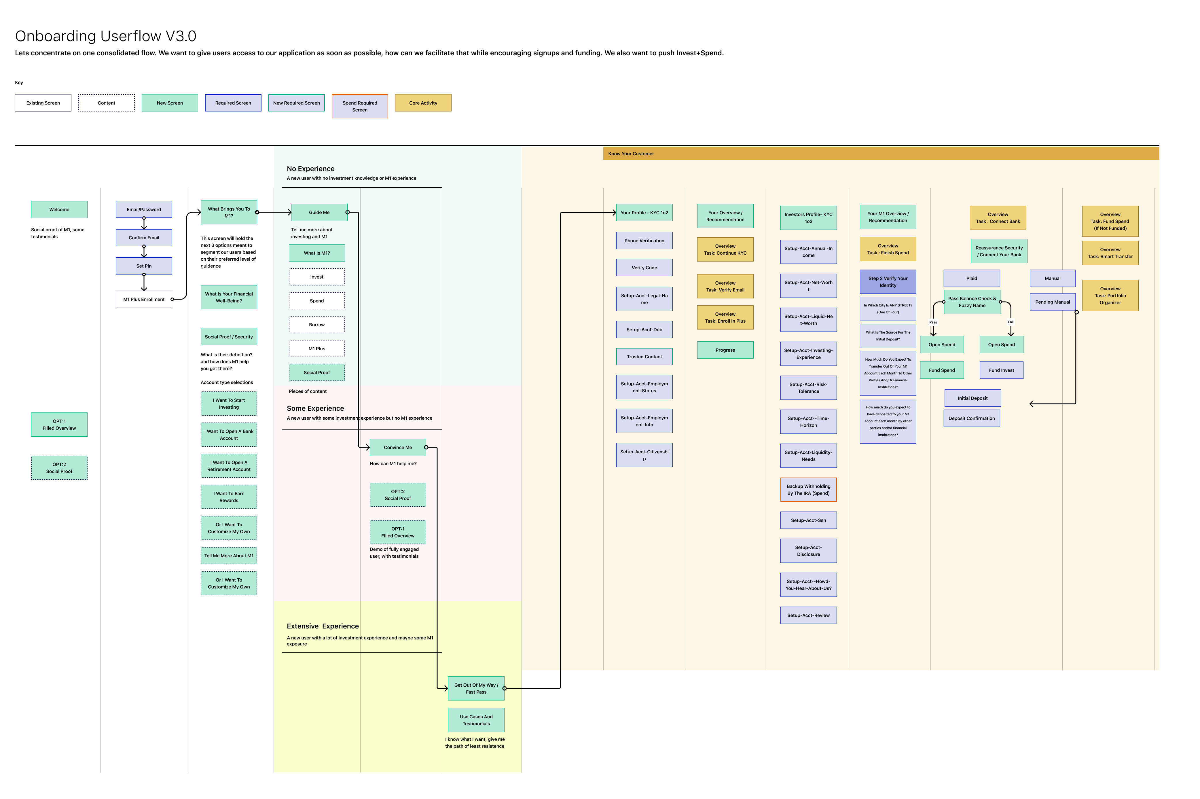
What we could control was everything around those screens: the framing before users entered KYC, the explanations we offered at each step, the way we handled errors, and how we brought users back into the product experience once KYC was complete.
KYC requirements in financial services are non-negotiable. Eighteen screens in our flow existed purely to satisfy legal requirements: identity verification, address confirmation, Social Security collection, and more. We had no authority over what questions were asked or in what order the regulators required them. There were also new regulatory updates during the project that we had to absorb into the redesign while it was already in progress.
The insight that changed the approach came from the data. Roughly 80% of M1's revenue came from the top 20% of users, and that segment skewed toward financially literate people who were already comfortable with investment apps. They weren't looking for a tutorial. They were looking for a fast, confident path to getting their account open and their money moving.
.jpg)
Early in the project I made a mistake I see a lot of designers make, including myself before this. I tried to design for everyone. I built flows that would accommodate every possible user type, every edge case, every path through our account types. The result was a sprawling decision tree that didn't do anything well.The insight that changed the approach came from the data. Roughly 80% of M1's revenue came from the top 20% of users, and that segment skewed toward financially literate people who were already comfortable with investment apps. They weren't looking for a tutorial. They were looking for a fast, confident path to getting their account open and their money moving.
That narrowed our focus significantly. Rather than designing for the user who had never opened a brokerage account before, we optimized for the user who had. That decision shaped every subsequent call on copy, screen count, and information density.
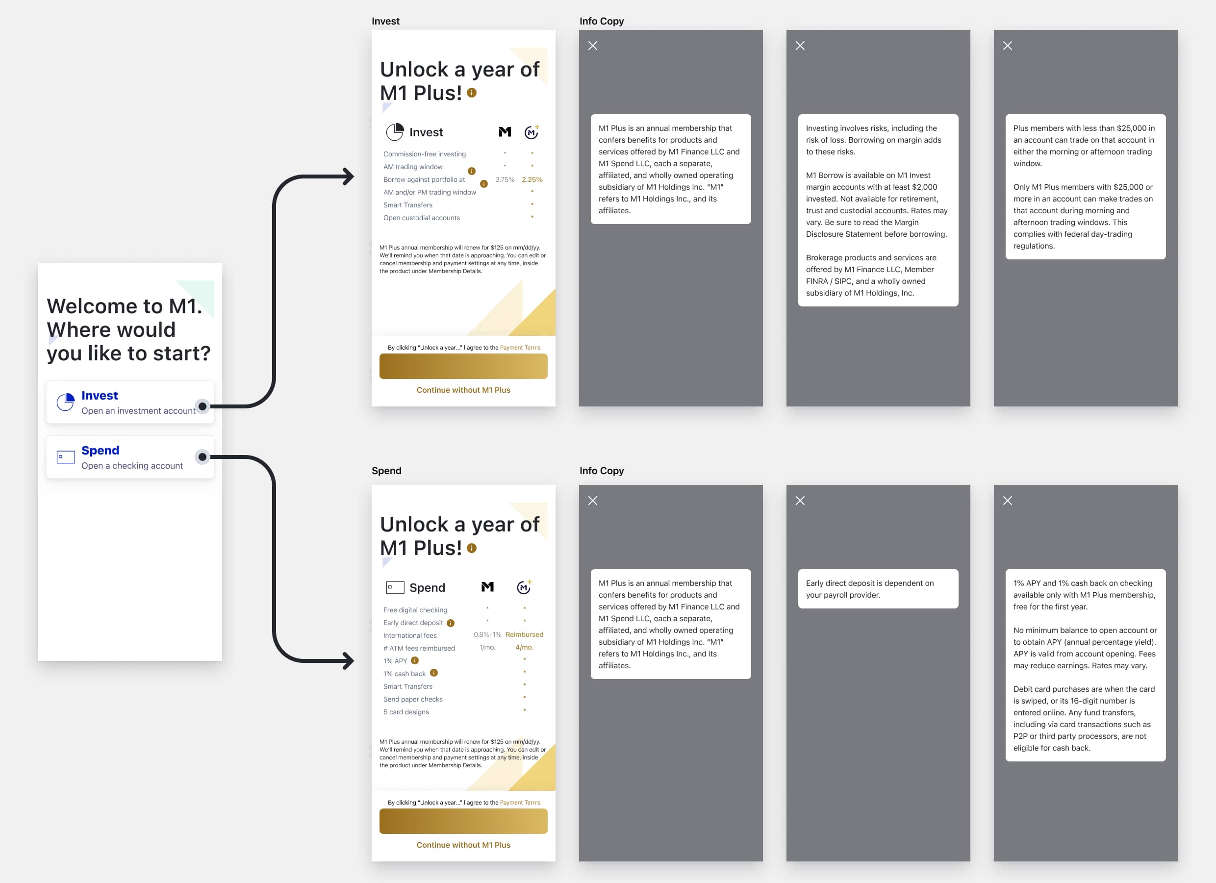
We decided to lead with a combined invest and spend account option. The complication was that invest and spend were different account types under the hood, each requiring their own KYC path. A user choosing both effectively needed to complete two compliance flows. The design challenge was building a single, coherent onboarding experience that could accommodate either selection without making the user feel like they were starting over.

The Social Security number collection screen had the highest drop-off rate in the entire flow. Our first instinct was to address it by introducing trust builders and social proof, either on the screen or just before it. We tested the hypothesis and found the opposite was true: any additional screen added friction. Users who had made it that far through KYC didn't need more convincing. They needed to get through it quickly.
What did move the needle was transparency on the screen itself. We added explanatory copy directly on the SSN screen explaining exactly why we needed the number and how it was used, rather than hiding that information behind an info icon. Making the reasoning visible by default reduced hesitation without adding steps.
The core trust builder ended up being speed. Getting users to that screen faster, with less buildup, performed better than any reassurance we put around it.
The original flow included a "How M1 Works" walkthrough and a tutorial for building your first investment pie. These sat between account creation and the upsell moment for our premium product. Both were well-intentioned but they were interrupting users who were already sold on the platform, slowing them down with a description of the product they had just signed up for.
We removed both screens. But rather than leaving users with nothing after account creation, I designed a post-onboarding roadmap tracker to replace them. Instead of explaining how M1 works in the abstract, the tracker showed users exactly what they needed to do next to get their account fully set up: verify your email, connect your bank, make your first deposit. Personalized to where they actually were in the process, not a generic product tour.
The distinction matters. The original tutorial assumed users needed convincing. The tracker assumed they were ready to act and gave them a clear path to do it. We also repositioned the premium offer as a result of removing those screens.
That combination drove the largest single improvement in the project.
.jpg)
