
Pangea Design System
Senior Product Designer
A challenge for Pangea was replicating a streamlined process across multiple products and languages. The main goal of our DS was to help us increase our speed of production.


.png)


Even before the addition of a new card, our application features were quickly beginning to increase in complexity. Given the amount of changes we were purposing, it was important to us to have an awareness of customer impact. I would regularly integrate customer feedback into final design decisions, via user research and customer surveys.


Form the beginning of the project we noted rough success metrics, adjusting them as the product evolved, but always setting goals to KPIs to measure against.

It was important for us to start learning about our customers feelings and behaviors around banking, specifically the sharing of personal information. Our users are known to, for multiple reasons, not trust banks, understandably so we needed to uncover how we could make it easier.
The SSN requirement for an account is a huge barrier for our customers, with an estimated 25% representing undocumented workers. We looked to introduce ways to support other forms of government issued IDs specific to Mexico.
In order to quickly start learning from the real product and live customers we decided to run a waitlist as the first exposure test. We let a controlled group of users start to see promotion banners for the upcoming Pangea Card, to get a good sense of the demand within existing users.

Only 15% of our english users started to see the promo. Besides the usual metrics we wanted to see how the new promotion and splash pages impacted the overall use of the app.
With the success of our first waitlist, the business felt more comfortable making the investment for another release.
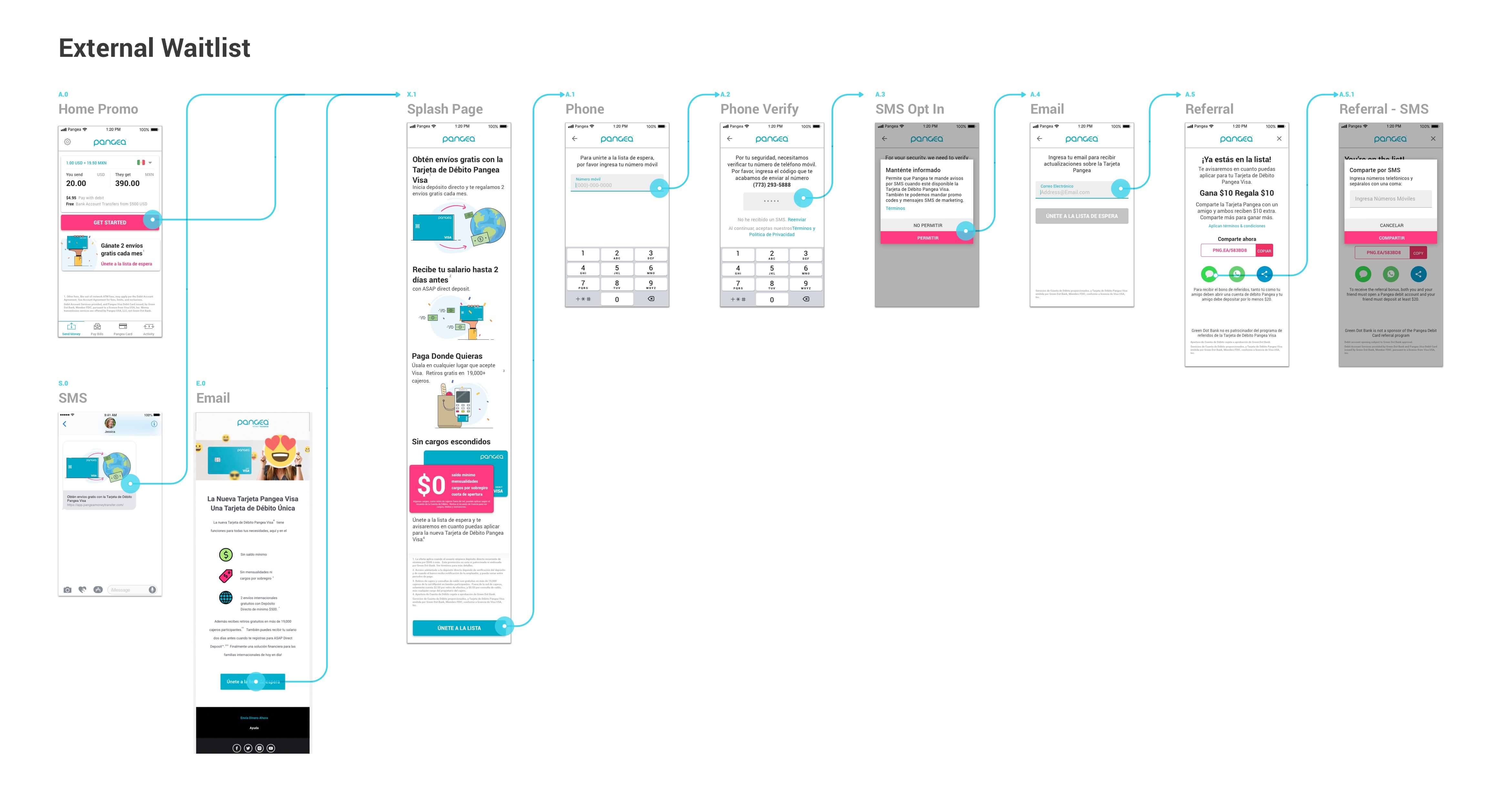
A revised version of the waitlist we coordinated with an external marketing campaign.
After making adjustments to our main promotional banner and splash page we were able to increase our conversion rates from home page into the sign up. We were comfortable with our discovery and sign up path, and we were ready to push out the full functionality.

.jpg)
We started to learn a lot about the how to position our product features and the benefits to highlight. For anything uncertain we would run A/B tests on, continually measuring performance for our promotions, and splash pages.
Initially from interviews, we heard a lot of people emphasize the importance of - $0 down, No Minimum Balance, No Over draft fees - But when it came to our users, those benefits weren't seen as a unique enough offering.


50% of our users would be exposed to the full functionality of the application. While I had improvements designed and spec'd out already ACH and Matricula
Given the latest data we started to see where our product needed the biggest improvements. The ultimate success for us was getting people to fund their accounts. We needed to move users through the Pangea Card funnel more effectively by consistently and strategically reminding them of their next step.
In addition to improving ways to fund the account we also took note a decrease in remittances among users that could see the promo. Our early hypothesis was that perhaps with the addition of the Card promo, some users were not able to see the repeat transfers above the fold, decreasing their likeliness to use it. In response we not only redesigned our promo banners, we came up with a system of app notifications that would strategically nudge users down the funding flow.

We planned to keep pushing the product and learning from our users, but unfortunately due to CO-VID we had to pause our front end development work and a handful of the team was let go, including me. I hope the team is able to keep the product progressing and helping our users, I encourage you to check out Pangea Money Transfer for any of your international money transfer needs.


